Component Libraries
Component libraries in the templ ecosystem provide ready-to-use UI elements.
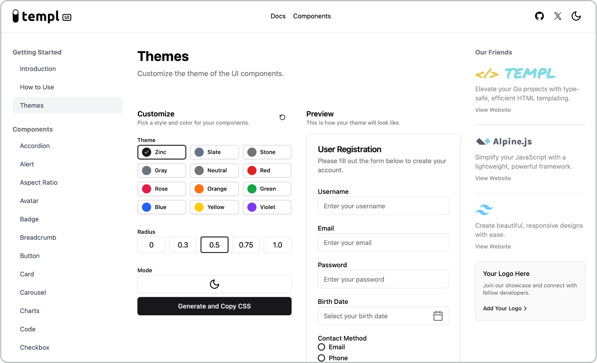
templUI
About
templUI is the premier UI component library built specifically for templ. It combines the type-safety of Go with the interactivity of Alpine.js and the styling power of Tailwind CSS to create beautiful, responsive web applications.
Features
- 30+ Ready-made Components: Buttons, cards, modals, charts, and more
- Enterprise-Ready: Built for production with security in mind
- CSP Compliant: Works seamlessly with Content Security Policy
- Type-Safe: Full Go type system integration and checking
- Customizable: Easily adapt to match your brand identity
Example
import "github.com/axzilla/templui/components"

templ ExamplePage() {
  @components.Button(components.ButtonProps{
    Text: "Click me",
    IconRight: icons.ArrowRight(icons.IconProps{Size: "16"}),
  })
}